The Advertising Foundations brief ‘The Great Outdoors’ directed me to develop a billboard concept for outdoor advertising to promote Melbourne, I chose to execute my design specifically for a metrolite on trams.
In addition to this design a written rationale is required to accompany the execution that documents my thought processes, presents my research and justifies my creative decisions and choice of media.
My rationale:
A global historical icon of Melbourne city is Flinders Street Station, and designing its dome to look like a burger was the idea for this execution. This idea is effective as it conveys the beautiful architecture of the building while also communicating along with other design executions in the pitch that Melbourne is food diverse and this is what makes the city great. [Sydney Morning Herald 2011]
The design was kept simple overall and presented like an icon, yet colourful and intricate with its line work to present the beauty of the architecture. More colours were focussed on the burger and its ingredients to be slightly more eye catching, and the architecture is presented with the classic colour of the building. The whole design is framed in a thick border with the burger popping out of the top to communicate it in a majestic scale.
The design will be displayed on the trams that service Melbourne locals, it has been adapted for tram portrait sides that are 1400mm wide x 2100 mm length. The appeal is it provides the ability to display multiple advertising on each portrait board alongside a tram, but could also display various executions on multiple portrait boards across one tram too. It’s a great choice for advertising as trams are constantly travelling through the city past major shopping and business locations day and night.
This was a group assignment where we are required to to produce a series of three (3) postcards to form the basis of a promotional campaign.
We were to research, develop concepts and design our solutions before producing a final artwork. The objective of this is a give-away pack of postcards is to reinforce the brand essence using an indirect advertising approach, to get consumers to think about the brand, place or organisation in an unexpected way and to create an interesting and creative component to encourage consumers to keep the cards.
From the list of three brands to choose from was Zoos Victoria, Melbourne International Film Festival and Queen Victoria Market. We chose QVM for our postcard campaign to move forward as its one of the icons of the city of Melbourne.
The Rationale:
Our target audience is fundamentally anyone with a mouth, aged between 5 - 45. This includes families with children, young adults, students and travellers who will enjoy the market culture Melbourne has to offer at QVM. The message we are communicating is a Fresh, Fun and Food experience at the Queen Victoria Market. With fresh produce, fun activities for all and a list of delicious food stalls with cuisines from around the world, the outcome is an immersive market experience.
The message is conveyed using three words that connect the experience of the market: Fresh, Fun, and Food. We then explored onomatopoeia to match our copy, to create an engaging sound/hearing experience. We used ‘Mmmm...’ to communicate freshness, ‘Whoopee’ to communicate fun, and ‘Slurp’ to communicate delicious food.
Pushing the idea a little further, we connected the copy using color psychology to ensure an optimum audience reception and experience. The step after that was to communicate some edge to the copy by adding effect enhancements to the type design on the card.
The sound of ‘Mmmm’ is then communicated in a sound wave as its would be melodically heard when one says it. The sound ‘Whoopee’ was designed in a spiral slide to communicate fun with lettering edges painted with streaks like playground equipment. The sound of ‘Slurp’ took the ‘U’ as a bowl and filling it with circular lines to communicate noodles and two chopsticks.
The final step was to connect the whole idea to social media with the #SoundsofQVM
hashtag that encourages people to share their fresh, food and fun experience
This graphic design course project is a journey of discovery into one typeface. I was given the Futura typeface to research and discuss uses and applications, its history and how it evolved or changed, how is it used in the commercial advertising world and its beginning with who designed it? Including 3 visual references in the poster is one of the requirements.
When creating the poster and choosing what information to include, select areas or points that would be interesting for people to read, or that people might want to remember.
Remember that this is all about Visual Communication. Consider typography, composition/layout, scale, use of colour and format.
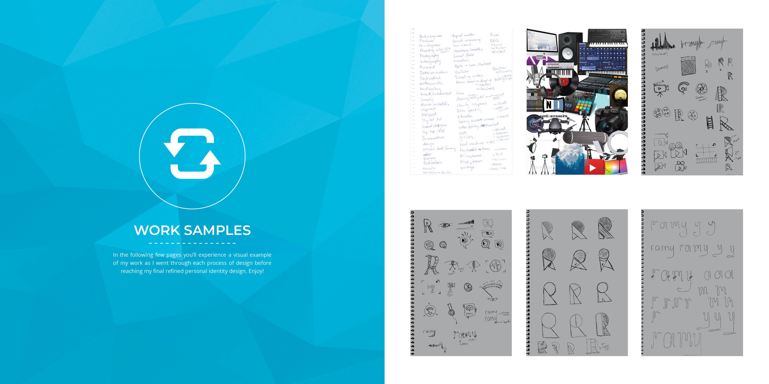
The task for this was to create a typographic poster using my name (as the headline), colour and body copy (100 words approx.) to convey your key personality traits.
Using InDesign, Illustrator and/or Photoshop, as appropriate, produce your ‘poster’ in A4 vertical format. Your body copy must include about 100 words that describe YOUR key personality traits expressed in the poster. The body copy must be formatted into 2 or 3 LINKED text boxes.
The body copy:
Ramy, the name means marksman in Arabic. Having this name given to me has allowed me to instil several positive attributes in myself.
I find myself in a constant thirst to seek knowledge, not just in one chosen subject or niche, but rather, I feel drawn to various subjects of various fields and disciplines, and feel unwearied and enthusiastic to be able to pursue them.
This curiosity or inquisitive thinking I possess has taken me on an amazing journey of exploration, investigation and various learning experiences.
I think its having an unrelenting desire for self development, to experience as much as I possibly can, and for purposes of progress and growth I seek accurate answers and having certainty in what I’ve learnt and experienced is a great payoff to the hard work.
It’s important for us to seek all types of knowledge in order to expand our capacities and capabilities creatively, intellectually, socially and environmentally.
I’ve discovered that this desire, passion and focus stems from an appetite for understanding, this can be positively infectious to those around me, and that is inspirational.
This Intro to Graphic Design assessment I was to develop a Studio Knowledge Object [SKO] that captures and communicates my insights and development through the studio as a reflective practitioner. We were to evaluate the benefits of our learning and propose how this can be applied in our future career. This needed to be a hardcopy publication and we needed to consider the layout composition, grid structure, colour palette and typography.
For this execution we were asked to make a storyboard for a Dulux Wash & Wear TV/video campaign based on the idea used from my previous Dulux ad brief which was to take a real Dulux colour and establish it as a headline in the ad. I chose the colour ‘Bright Delight’ to which I then headlined ‘Experience Bright Delight’.
Quick Briefs given to us during RMIT Hungry Talks.
A weekly seminar where advertising industry professionals return to provide industry advice and brief students with quick briefs to execute.
Quick brief 1: ABSOLUT VODKA
SMP: Absolut Vodka Is Proudly The Spirit of Pride.
Objectives: Align Absolut Vodka with the key cultural moment of Mardi Gras 2020, Drive purchase, Show support & solidarity to the queer community, Demonstrate Absolut Vodka’s longstanding history of being involved with this group.
TA: Australian queer community & participants of Mardi Gras 2020. Urbanites 25-34 who live within a 5km radius of the CBD, high disposable income, culturally engaged, socially active and aware.
Channels: This will activate to launch the rainbow bottle the weekend ahead of the 2020 Mardi Gras.
Activation: scaleable with product front and centre.
Execution: Transport Metrolite’s
Quick Briefs given to us during RMIT Hungry Talks.
A weekly seminar where advertising industry professionals return to provide industry advice and brief students with quick briefs to execute.
Quick brief 2: BOWEL CANCER AUSTRALIA
SMP: Knowing your shit could save your life.
Objectives:
Get 25-29 year olds to give a shit about their shit by putting poo health at the front of the bowel cancer conversation.
TA: 25-29 males & females
Execution: Metrolite & Instagram ad
Quick Briefs given to us during RMIT Hungry Talks.
A weekly seminar where advertising industry professionals return to provide industry advice and brief students with quick briefs to execute.
Quick Brief 3: MARS BAR
SMP: Enough chocolate to deal with anything.
TA: Millennials
Channels: Non Traditional
- Floor ad in busy shopping malls
- Stairs advertising at train stations